


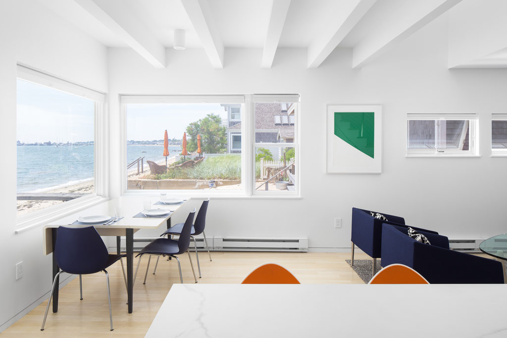
Let’s talk about color. So much of what we see in interiors today is stark white space, usually accented by small splashes of color, neutral tones, or often even more white. We consider this aesthetic to be clean and contemporary — a nod to early modern architecture, which was largely characterized by simple white walls breaking free from the ornate décor of the past to allow new architectural forms to speak for themselves.
However, even Le Corbusier, one of the forefathers of modern architecture whose work was filled with whitewashed interiors, did not apply the color universally. He developed very specific theories regarding the use of white and color and their spatial and emotional effects, which remain relevant and useful today.
Part of Corbusier’s work included the creation of his color palettes from which he would make very deliberate selections about how and where each color would be used to stimulate specific feedback. Bold colors quickly draw our eye and can significantly influence the way we perceive space. With other walls painted white, Corbusier would choose a bold color for a series of walls to direct physical circulation and to visually dissolve the reading of isolated spaces.
 Bold colors tend to evoke the strongest emotions, whether from personal memory, history, or from visceral responses. More subdued colors are still very powerful tools, generating calmer and often comforting human responses. A darker muted tone will absorb light, creating an entirely different spatial effect by directing our eye away from colors and towards light-reflecting surfaces. Corbusier would use these colors to diminish the visual presence of certain architectural elements in order to emphasize others.
The use of white is impactful, but most effective when applied deliberately. We consider white to represent purity, morality, and renewal and its ability to reflect light and color makes it extremely versatile. It plays an important role in architecture and interiors when used thoughtfully; strategically placed to reflect light and improve the experience of a space, or used as a blank canvas so that other colors can be celebrated. The colors we surround ourselves with define our perception of interior spaces, so before opting for white as an easy default, consider how color can improve our architectural experiences.


